The Psychology of Colour in Interior Design: Creating the Right Mood
Colour is one of the most powerful tools in interior design, influencing not just how a room looks but how it feels and how we behave within it. Understanding colour psychology can help you create spaces that support your wellbeing and enhance your daily life.
Warm colours and energy. Reds, oranges, and yellows are energising and stimulating. They increase heart rate and appetite, making them excellent for kitchens and dining areas where you want to encourage activity and conversation. However, too much warm colour in bedrooms can be overstimulating and interfere with sleep.
Cool colours and calm. Blues, greens, and purples have the opposite effect, promoting relaxation and concentration. These colours are ideal for bedrooms, home offices, and bathrooms where you want a sense of calm. Light blues and soft greens are particularly effective for reducing stress and anxiety.
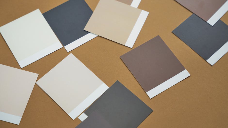
Neutral colours and balance. Whites, greys, and beiges provide a restful backdrop. They make spaces feel larger and cleaner, but can feel cold or impersonal if used exclusively. Use neutrals as a base and add warmth through accessories and accent colours.
Using colour strategically. You don't need to paint all four walls the same colour. Consider painting one accent wall or using colour on woodwork and doors. This adds visual interest without overwhelming the space. Darker colours make rooms feel smaller and cosier; lighter colours make them feel larger and airier.
Colour and light. Colour appears different depending on natural and artificial light. Test paint samples on your walls at different times of day before committing. North-facing rooms need warmer tones to compensate for cool natural light; south-facing rooms can handle cooler colours.
Personal preferences matter. Whilst colour psychology offers guidelines, your personal response to colour is equally important. If blue makes you unhappy, don't use it just because it's supposed to be calming. Your instinctive preferences often reflect what genuinely works for your wellbeing.
Practical application. For living spaces you use daily, consider colours you genuinely love rather than trendy options. Bedrooms benefit from calming palettes—soft blues, greens, and warm neutrals. Kitchens and dining areas work well with warmer tones. Home offices need colours that promote focus without being monotonous.
Colour is personal and powerful. Take time experimenting with shades, and don't underestimate how much the right colour palette can transform not just your space, but your mood and productivity.